Daybreak Theme
Note status: ![]()
In Brief
My fave color theme, plus some of my customizations.
Horizon, then Daybreak
I’m a big fan of dark themes. I’ve been using variants of Horizon for quite a while now in VS Code (as you can read about in vs code note), since I like the overall warmth of the theme’s color palette.
Unfortunately, the person who initially designed Horizon doesn’t seem to be actively maintaining it. Their original version is no longer findable in the VS Code extensions respository. Thankfully, the Daybreak variant fills this void nicely!
Color Contrast
Activity Bar Contrast
The one thing I’m not a fan of about Daybreak is that the activity bar icons are extremely low-contrast. Especially if you lower the brightness of your monitor, you almost need to remember the order of the icons in order to know where to put your cursor.
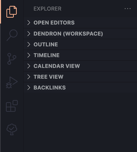
Here are the original colors:
VS Code lets you add customizations, so this isn’t difficult to override.
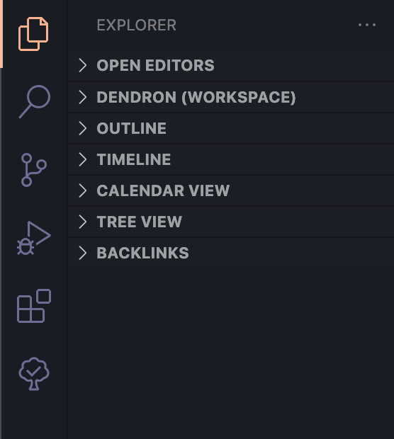
Here are the colors I’m using as of 2022-04-21:
This is what I’ve added to my settings.json file to achieve this:
    "workbench.colorCustomizations": {
        "activityBar.inactiveForeground": "#6C6F93"
        }
The snippet above applies the dark purple/gray (which—apologies for the low contrast on this page—looks like this) from the original Horizon theme’s Dark UI palette just to the inactive icons. This makes the colors much easier to see on a dimmed monitor.
Here’s a version that lands somewhere in between, which you might prefer if your monitor is often at full brightness.
This is the code to achieve these colors:
    "workbench.colorCustomizations": {
        "activityBar.inactiveForeground": "#6C6F9395"
        }
The original value for the purple/grey is #6C6F93 — and in the above snippet, the last two digits in the code reduce the opacity from 100% to 58.5%. This is more than enough to help “situate” the color in the bar, at least to my eyes. It’s a good balance of increasing the contrast while still visually prioritizing the active icons.
But wait—why does 95 equal 58.5%? I’d forgotten that these values are in hex notation—and therefore, anything in the 90% range would need to start with F.
Scrollbar Contrast
Update on 2023-03-01:
I noticed earlier today that in a very long file, I could barely make out the scrollbar.
So I’ve added the below lines, to quickly make the scrollbar the same color as the inactive icons in the Activity Bar, and to make it slightly darker when I’ve hovered over it.
    "workbench.colorCustomizations": {
        "scrollbarSlider.background": "#6C6F93",
        "scrollbarSlider.hoverBackground": "#6C6F9395"
        }
If I were really making a “proper” theme, I’d probably take the time to make the scrollbar a little lower contrast, as it’s much more more obvious in this shorter file. But the overall point of this note is precisely this opportunity for customization!
Other Themes
Even if you don’t love this particular theme, hopefully this note helps you trick out VS Code however suits you!
-
 = emerging note
 -
 = established note
 -
 = evergreen note
- open access = open access
-
 = paywalled
 - general web link = general web link
Kudos
Did you enjoy this? Let me know:
Perhaps even leave a comment below?
Leave a comment